Why Light Comes Before Color
Before you commit to a paint chip or a furniture finish, walk through each room at different times of day and pay attention to how the light behaves. Natural light is not neutral-it carries a color temperature of its own that shifts with the compass direction your windows face, the season, and the time of day. A color that reads as a soft sage green in a showroom can look muddy gray in a north-facing bedroom or electric teal in a sunlit southern room.
This is the core principle behind choosing a warm or cool interior direction: you are not just selecting colors you like, you are working with the light already in the room. Design fundamentals like light, scale, and flow all interact with your palette choice in ways that determine whether a room ultimately feels inviting or off-putting.
As a starting framework: north-facing rooms receive indirect, cooler-quality light all day, making warm tones a reliable counterbalance. South-facing rooms get strong, warm light for much of the day, giving you the flexibility to use cooler palettes without the space feeling sterile. East-facing rooms are warm and bright in the morning but cool off by afternoon; west-facing rooms do the reverse.
What Warm Interiors Actually Look Like
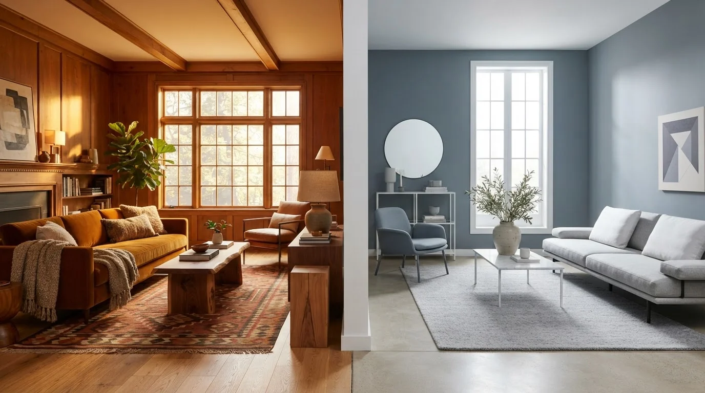
A warm interior palette draws from the red, orange, yellow, and brown quadrant of the color wheel-think terracotta, amber, cream, caramel, and deep olive. These tones appear in wall paint, but just as importantly, they show up in wood furniture finishes, natural fiber textiles like jute and linen, leather upholstery, and warm-toned metals such as brass and bronze.
Warm rooms tend to feel intimate and grounded. They are a natural fit for living rooms and dining rooms where social connection is the goal. The perceived coziness comes partly from the colors themselves and partly from the textures that typically accompany them-chunky knit throws, matte ceramic vessels, rough-hewn wood. Soft furnishings like rugs and curtains amplify the warmth of a palette significantly, so account for them when planning.
| Warm Interiors | Cool Interiors | |
|---|---|---|
| Core palette | Reds, ambers, creams, earthy browns | Blues, grays, whites, blue-greens |
| Best light exposure | North- or east-facing rooms | South- or west-facing rooms |
| Mood effect | Intimate, cozy, grounded | Calm, open, focused |
| Typical materials | Wood, leather, jute, brass | Painted finishes, linen, chrome, matte black |
| Common risk | Can feel dark or heavy if overdone | Can feel cold or sterile without texture |
| Best room uses | Living rooms, dining rooms | Bedrooms, offices, small rooms |
One common misstep: going so warm that a room feels dark or heavy. Balance is essential-pale warm neutrals on walls with richer tones in furniture and accents prevent the palette from becoming oppressive.
What Cool Interiors Actually Look Like
Cool interiors draw from blues, blue-greens, grays, and crisp whites. In practice, this means walls in soft slate, pale aqua, or cool greige (a gray-beige blend that leans blue rather than yellow), paired with furniture in white oak, painted finishes, or dark charcoal upholstery. Metals skew toward chrome, brushed nickel, or matte black.
These spaces feel open, calm, and visually organized. They tend to read as larger than warm rooms of the same dimensions because cool tones recede visually. This makes them well-suited to smaller rooms where you want to create a sense of space, or to bedrooms and offices where mental clarity and calm are priorities. Research on room color and mood suggests blues and cooler hues are consistently associated with reduced perceived stress, though individual responses vary considerably.
The risk with cool palettes is sterility. Without textural variation-linen curtains, a wool rug, varied cushion fabrics-a cool room can feel clinical. Lighting plays an especially important role here: layered lighting from multiple sources softens a cool interior in ways that a single overhead fixture simply cannot.
Blending the Two: When One Direction Isn't Enough
Most well-designed rooms do not live entirely in one temperature camp. A cool-palette room gains life from a single warm wood coffee table or a set of amber glass vessels. A warm-palette room can feel fresh and modern with the addition of slate-blue linen curtains or a cool-toned area rug.
The key is to let one palette lead and the other accent. Roughly 70-80% of the visual weight in warm-dominant or cool-dominant finishes, with the remaining 20-30% pulling from the opposite direction, tends to produce rooms that feel intentional rather than indecisive. If you are decorating a living space from a blank slate, choosing your dominant temperature direction first makes every subsequent decision-furniture, textiles, lighting fixtures-significantly easier to navigate.
Your home's fixed elements-flooring, cabinetry, brick, tile-often make the decision for you. Work with them rather than against them, and let the moveable elements (paint, textiles, accessories) do the fine-tuning.