
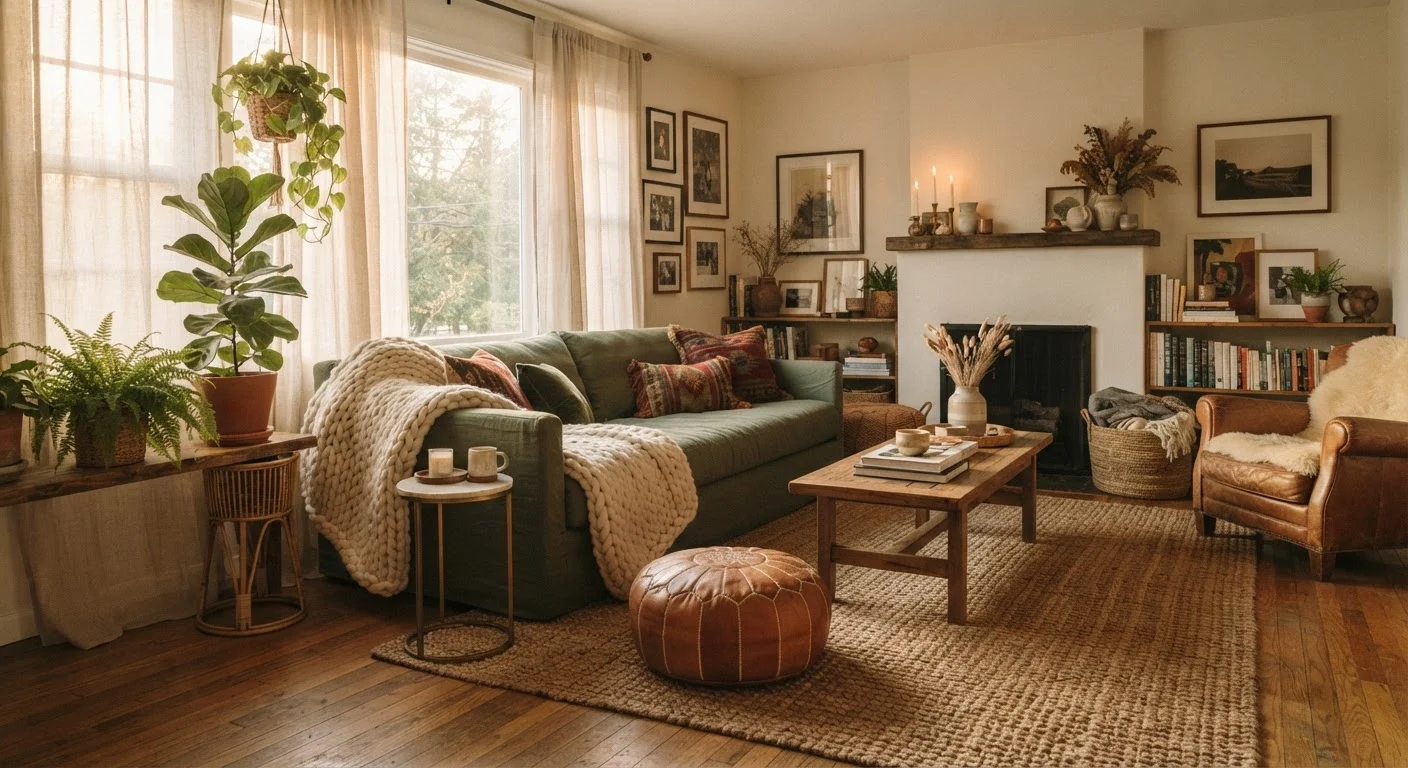
Scale: Getting the Proportions Right
The single most common reason a room feels wrong is scale. When a sofa is too large for a living room, or a dining table too small for the space around it, the room sends subtle signals that something is off - even to people who can't articulate why.
Scale isn't just about individual pieces fitting physically; it's about how they relate to each other and to the room's dimensions. A collection of small furniture in a large room can feel sparse and disconnected. Oversized pieces in a compact space feel oppressive. The goal is proportional harmony - where each element feels like it belongs in relation to everything else.
A practical starting point: before purchasing furniture, sketch the floor plan and mark clearance zones. Primary walkways generally need at least 30-36 inches of clear space for comfortable movement. Secondary paths - between a coffee table and sofa, for instance - work at around 18 inches. These aren't rigid rules, but they give you a functional baseline.
Test Scale Before You Buy
Use painter's tape on the floor to outline the footprint of furniture you're considering. Live with those outlines for a day or two - walk around them, see how they affect movement. This simple step can prevent costly sizing mistakes and help you visualize clearance paths before anything is purchased.
Light: The Layer That Changes Everything
Lighting is the most underestimated element in how a room feels. Most rooms rely on a single overhead fixture - which creates flat, uniform illumination that flattens texture, casts unflattering shadows, and makes spaces feel clinical rather than comfortable.
Designers typically think about light in three layers: ambient (general illumination), task (focused light for specific activities), and accent (light that highlights objects or architectural features). A room that uses all three feels richer and more intentional than one that relies on overhead light alone.
Natural light also plays a role that artificial light can't fully replicate. How a room is oriented - which direction its windows face - affects the quality and warmth of daylight throughout the day. Understanding that relationship helps you make better choices about color and finish. Our guide on warm vs. cool interiors explains how your home's natural light should guide these decisions.
68%
Homeowners who say lighting affects room comfort most
According to a Houzz survey on home renovation priorities, lighting consistently ranks among the top factors homeowners cite when describing what makes a space feel welcoming.
3 layers
Lighting types used in well-designed rooms
Interior design professionals generally recommend ambient, task, and accent lighting in combination to create depth, function, and visual warmth in any room.
18-36 in
Recommended furniture clearance for comfortable movement
Residential design guidelines commonly cite 18 inches for secondary paths and 30-36 inches for primary walkways as baseline clearances for functional room flow.
Texture and Visual Weight: Beyond the Surface
A room furnished entirely in smooth, flat surfaces - glass, lacquered wood, polished metal - tends to feel cold and hard, regardless of the colors involved. Texture introduces sensory variety that makes a space feel livable and layered.
Textural contrast is the key concept: pairing rough with smooth, matte with shiny, soft with hard. A linen sofa against a painted brick wall. A jute rug under a glass-topped table. A knitted throw on a leather chair. These combinations give the eye (and hand) something interesting to engage with.
Closely related is visual weight - the perceived heaviness of objects based on their color, size, density, and material. A dark, solid wood bookcase carries more visual weight than an open, light-toned shelving unit of the same size. Distributing visual weight evenly across a room - rather than concentrating heavy pieces on one side - creates a sense of balance that reads as comfort. For more on how textiles contribute to this effect, see our piece on how soft furnishings shape a room.
Flow, Color, and Pulling It Together
Flow refers to how naturally people move through a space - and how the room is arranged to support or hinder that movement. A room with good flow feels effortless; you don't have to think about how to navigate it. One with poor flow feels frustrating even when it's visually attractive.
Furniture arrangement is the primary tool here. Grouping seating to encourage conversation, keeping pathways clear, and avoiding arrangements that force people to squeeze past furniture all contribute to a room that functions as well as it looks.
Color ties these elements together by shaping mood and perceived space. But color is more nuanced than simply picking a shade you like. The same hue can look dramatically different depending on the room's light, the finishes around it, and the saturation level. Our article on room color and mood separates evidence-based findings from popular myths - useful reading before you commit to a palette.
Ultimately, a room that feels good is the product of many small, interconnected decisions - not one dramatic transformation. Adjusting scale, layering light, introducing texture, and clearing circulation paths are each individually meaningful, and together they create the kind of space people genuinely want to spend time in.