Why Color Psychology Is More Complicated Than You've Heard
Walk through any home décor section and you'll find confident claims: blue calms, red energizes, yellow uplifts. These generalizations have become so common that many homeowners treat them as design law. The reality, according to color researchers, is considerably more layered.
Color psychology is a legitimate area of study, but laboratory findings don't always transfer cleanly to real home environments. Variables like room size, ceiling height, natural light, furnishing materials, and even a person's cultural background all interact with hue. Understanding what the evidence actually supports - and where it's still uncertain - can help you make better paint choices rather than just fashionable ones.
Before you repaint a room based on a mood board, it's worth taking stock of what you're working with. See our room evaluation checklist for a structured way to assess a space before committing to any change.
Common Myths - and What Research Actually Shows
The myths below are widespread enough to appear in mainstream decorating advice. Each one contains a grain of truth, which is exactly what makes them sticky - but each also oversimplifies findings from color research in ways that can lead to disappointing results.
Myth
Blue is universally calming and is always a safe choice for bedrooms.
Fact
Blue can support relaxation, but highly saturated or very dark blues can feel cold or oppressive depending on room conditions.
Studies do find that cooler, lower-saturation blues tend to correlate with reduced physiological arousal in controlled settings. However, "blue" covers an enormous range - from icy steel blue to deep navy to muted slate. A vivid, highly saturated blue in a small, poorly lit room may feel more claustrophobic than calming. Light levels, room proportions, and the undertones in adjacent finishes all mediate the effect. A soft, mid-value blue in a well-lit room is more likely to deliver the restful quality you're after than a dark or intense shade.
Myth
Red walls will increase appetite, making it a smart choice for dining rooms.
Fact
The appetite-red link is frequently cited but poorly supported by real-world evidence in home settings.
This claim is often traced back to studies of commercial restaurant environments - contexts very different from a home dining room in scale, lighting, and social function. Some research does associate high-arousal colors with increased activity levels generally, but translating that into a specific appetite effect in a private home has not been reliably demonstrated. Red is also one of the most visually demanding colors; in a small dining room, it can feel overwhelming over a long meal. If warmth and conviviality are the goal, warm earth tones and candlelight-compatible lighting are approaches with stronger practical support.
Myth
Yellow makes people feel happy and is ideal for kitchens.
Fact
Yellow can feel cheerful at low saturation, but intense or poorly matched yellows frequently cause visual fatigue.
Yellow's association with optimism is real in cultural terms, but high-chroma yellows are among the most fatiguing colors for the human eye to process over time. Kitchens present an additional complication: natural light shifts dramatically through the day, and a yellow that looks sunny at noon can look sallow or greenish under evening artificial light. If you're drawn to yellow, paint professionals generally recommend testing a large swatch at multiple times of day before committing, and favoring warm, creamy or ochre tones over stark primaries.
Myth
White and off-white are neutral and won't affect mood at all.
Fact
White is not a single color - its undertones actively interact with light and can make a room feel clinical, warm, or dingy.
"White" encompasses hundreds of commercially available shades with undertones ranging from pink and peach to gray and green. These undertones become more visible in context: a white with a green undertone can look fine on a chip but read as flat or cold against warm wood floors. Research on environmental psychology suggests that stark, high-contrast white spaces can feel stressful or sterile over time. The practical takeaway is that selecting white requires the same swatch-testing process as any other color - it is not a default safe choice, just a subtler one.
Myth
Dark colors always make a room feel smaller and should be avoided in tight spaces.
Fact
Dark colors can create intimacy and depth; perceived spaciousness depends on contrast, reflectance, and furnishing choices, not hue alone.
The idea that dark walls shrink a room is an oversimplification. Interior designers regularly use deep tones - charcoal, forest green, aubergine - to make small rooms feel cocooning and intentional rather than cramped. What actually drives perceived size is the contrast between surfaces and the overall light reflectance value (LRV) of a space. A dark room with minimal contrast between walls, ceiling, and trim can feel expansive; a small room with stark white walls and very dark furniture can feel more visually congested. Furniture scale and the amount of clutter generally have a larger impact on perceived spaciousness than wall color.
What Actually Drives Color's Effect in a Room
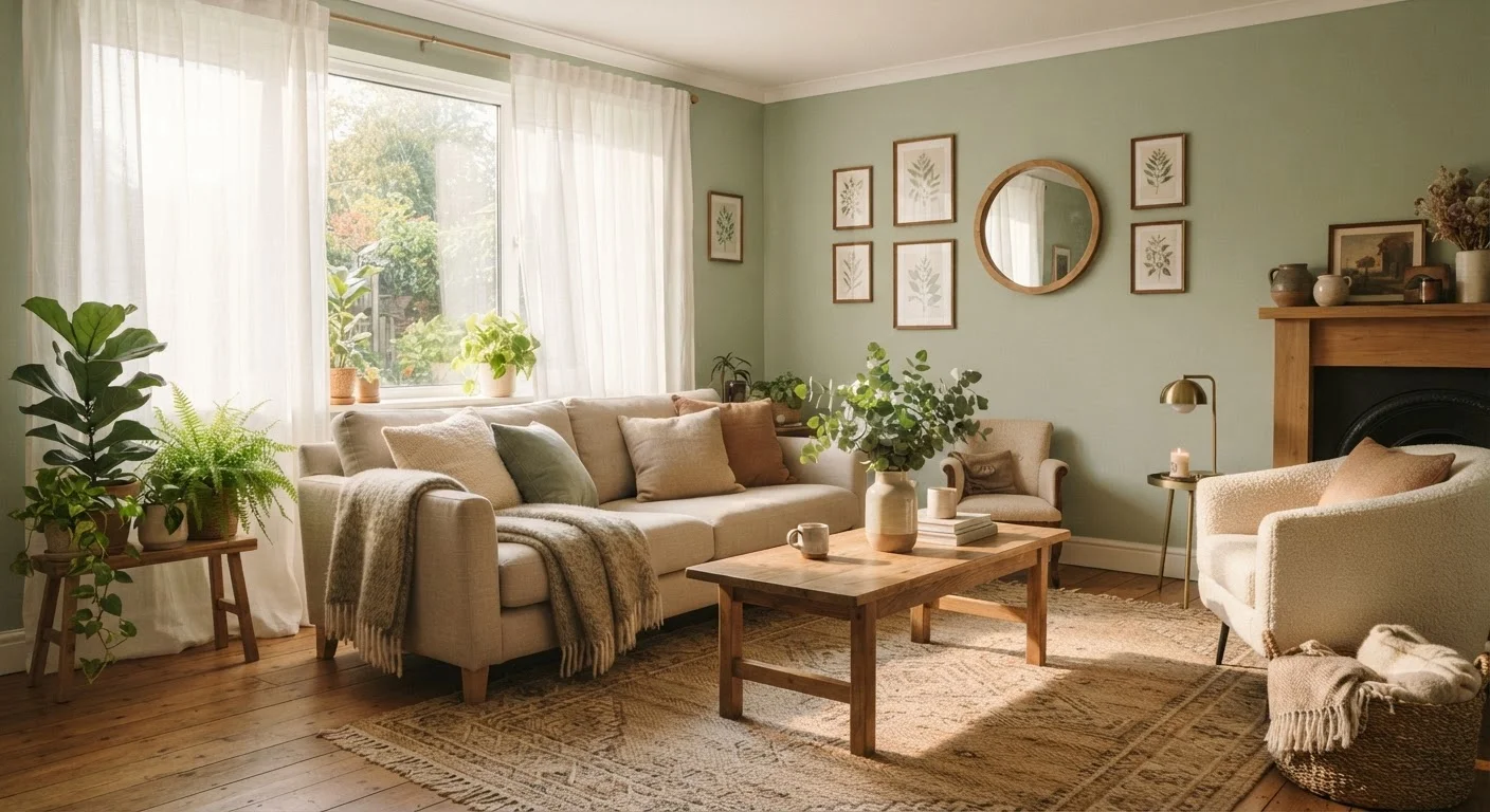
Once the myths are cleared away, a more practical picture emerges. Research consistently points to saturation (how vivid or muted a color is) and value (how light or dark) as stronger predictors of emotional response than hue alone. A highly saturated yellow-green can feel agitating; the same hue at low saturation reads as restful sage.
Lighting is the other dominant variable. A north-facing room with cool daylight will make the same paint color look noticeably different from a south-facing room flooded with warm afternoon sun. This is why paint chips on a store display rarely match what you see on your walls. For a deeper look at how light direction should guide palette decisions, our guide on warm vs. cool interiors walks through the practical choices.
~30%
Variance in color perception due to lighting source
Environmental psychology research suggests that the same paint color can reflect perceptibly different hues under incandescent, LED, and natural daylight conditions.
LRV scale
Standard measure of how much light a paint reflects
Light Reflectance Value (LRV) runs from 0 (absolute black) to 100 (pure white); most paint manufacturers publish LRV ratings to help consumers predict how colors will behave in different lighting conditions.
Soft furnishings also contribute more than many homeowners expect. Rugs, curtains, and upholstery introduce secondary colors and textures that shift how a wall color is perceived. Our article on how soft furnishings shape a room covers this interaction in detail.
For a broader view of why some rooms feel good and others don't, the principles behind a welcoming room - covering scale, flow, and texture alongside color - rounds out the picture.