Start With Intention, Not Inspiration Overload
A blank room can feel liberating or paralyzing depending on where you start. Most beginners jump straight to browsing images online, which quickly leads to a cart full of mismatched items that don't add up to a cohesive space. The more effective approach is to begin with intention: decide what you want the room to do and how you want it to feel.
Ask yourself a few grounding questions before spending anything. How many people use this space regularly? Is it primarily for relaxing, entertaining, working from home, or all three? Do you want it to feel energizing and bright, or calm and restful? These answers will narrow every choice that follows - from furniture scale to color temperature to the number of surfaces you leave clear.
For a deeper look at what makes a room genuinely comfortable to inhabit, see the principles behind a room that actually feels good to be in - it covers how scale, light, and flow work together at a foundational level.
Dominant color
The primary color that appears most in a room, typically on walls or the largest piece of furniture, making up roughly 60% of the visual palette.
Accent color
A contrasting or complementary color used sparingly in small accessories like cushions, artwork, or plants to add interest and personality.
Layered lighting
Using multiple light sources at different heights and for different purposes - ambient, task, and accent - rather than relying on a single overhead fixture.
Visual anchor
A large element, such as a rug or sofa, that defines a zone within a room and gives the eye a clear starting point for reading the space.
Focal point
The dominant feature of a room that naturally draws the eye first - such as a fireplace, large window, or piece of art - around which the rest of the decor is arranged.
Texture layering
Combining surfaces with different tactile qualities - soft, rough, smooth, woven - to make a room feel visually rich and physically comfortable.
Choosing a Color Palette That Works
Color is one of the most intimidating decisions for first-time decorators, but a simple structure makes it manageable. Work with three tones: a dominant color (roughly 60% of the room's visual surface), a secondary color (about 30%), and an accent (10%). The dominant is typically your wall color or largest furniture piece; the secondary appears in sofas, rugs, or curtains; the accent shows up in cushions, artwork, and small objects.
Neutrals - warm whites, soft taupes, greiges, and light grays - are forgiving dominants that let you shift the mood of a room by swapping out your accent color alone. If you want something bolder on the walls, test paint swatches in large patches (at least 12 inches square) and observe them at different times of day before committing. Natural light shifts dramatically between morning and evening and will change how a color reads.
Fixed elements you can't change - wood flooring tone, tile, brick, or existing trim - should inform your palette, not fight against it. Pull a color from those elements and let it guide your choices.
Anchoring the Room With Furniture
Furniture placement is where a room either comes together or falls apart. Before buying anything, measure the room carefully and sketch a rough floor plan. The sofa is typically the first and largest commitment - choose one proportionate to the room, not the largest one that will physically fit. A sofa that overwhelms the space makes everything else feel squeezed.
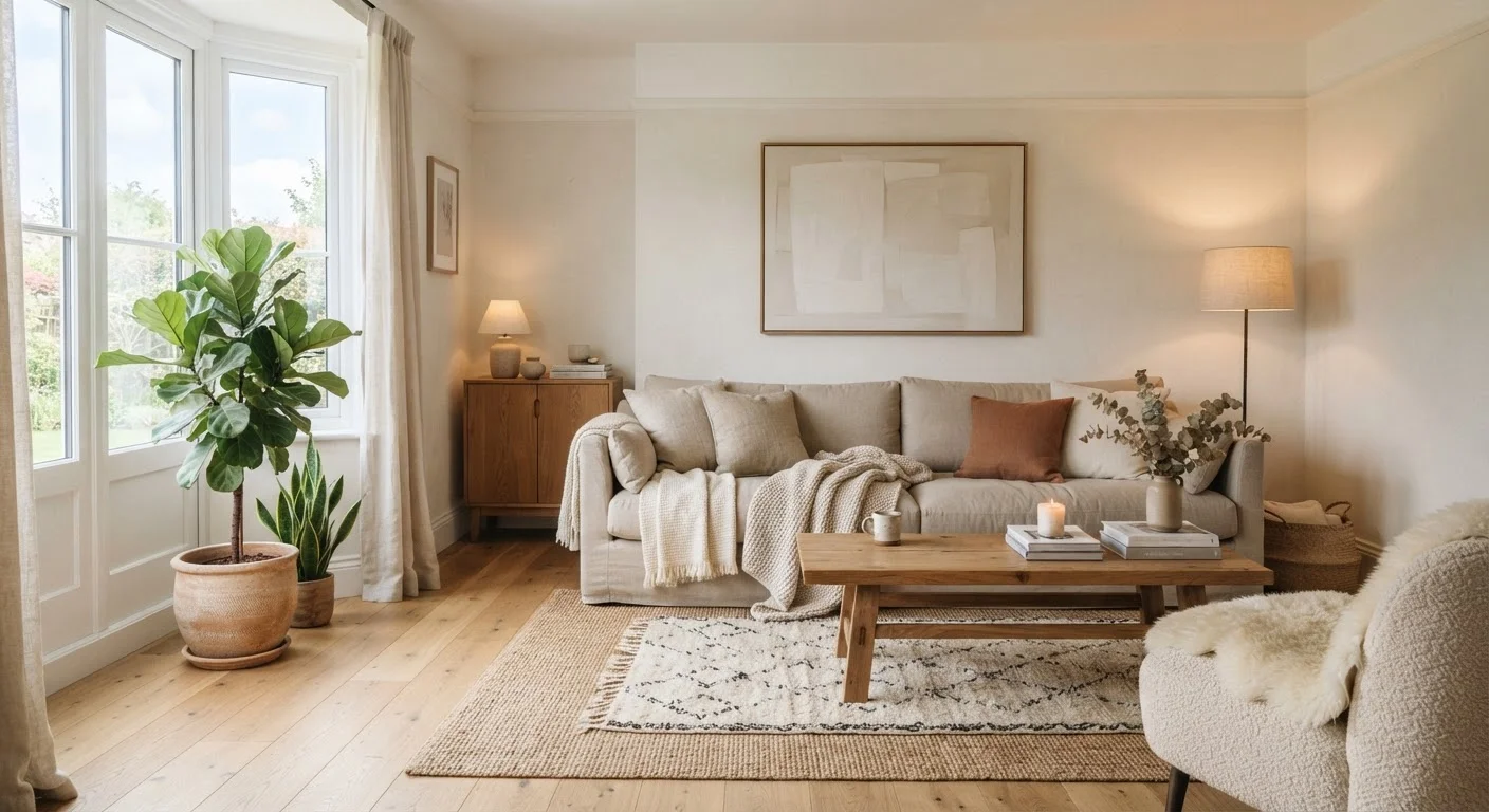
Once the sofa is in place, a rug anchors the seating area. In a living room, the front legs of all major seating pieces ideally rest on the rug - this visually unifies the grouping and defines the zone. A rug that's too small (a common mistake) makes the furniture look like it's floating rather than belonging together.
Arrange seating to encourage conversation: chairs should face or angle toward each other within a comfortable distance, generally no more than eight feet apart. Avoid pushing all furniture against the walls, which creates a waiting-room feel. For rooms with unusual shapes or open-plan layouts, furniture arrangement layouts for living rooms of every shape offers practical configurations for different floor plans.
Layering Light, Texture, and Accessories
Once the bones of the room are in place, layering is what turns a furnished space into a finished one. Lighting is the most impactful layer and the most commonly under-addressed. A single overhead fixture creates flat, unflattering light that makes rooms feel institutional. Instead, combine ambient light (overhead), task light (floor or table lamps near reading or work areas), and accent light (directed at artwork or shelving) to add depth and warmth. Layered lighting: why one overhead fixture is never enough walks through exactly how to approach this combination.
Texture is the second major layer. Hard, smooth surfaces - wood, metal, glass - need to be balanced with softer materials like linen, wool, woven baskets, or matte ceramics. A room that's all one texture reads as flat, even if the colors are nice. Throw blankets, textured cushions, a jute rug, or a chunky knit add the kind of tactile variety that makes a space feel genuinely inviting.
Start With What You Already Own
Before purchasing anything new, gather objects from other rooms - books, plants, candles, baskets - and test how they look in the space. You may discover you already have more than you think. Buying new pieces to fill gaps rather than to fill every surface keeps the room from becoming cluttered and helps your budget go further.
Accessories come last. Artwork, plants, books, candles, and decorative objects should be introduced gradually - step back frequently and evaluate whether each addition is adding to the room or simply filling space.
Finishing Touches Without Overdoing It
The final stage is editing as much as adding. Once the major pieces are in place and lighting is layered, walk through the room with fresh eyes and identify what draws your attention first. If it's clutter rather than a focal point - a fireplace, a piece of art, a well-styled shelf - remove items until the eye has somewhere intentional to land.
Group objects in odd numbers and vary their heights. A cluster of three items at different heights (a tall plant, a mid-height lamp, and a low stack of books, for example) is more visually interesting than a row of matching items. Leave some surfaces clear; empty space is not wasted space - it gives the eye a place to rest and makes the objects you do display feel more deliberate.
If you find the room accumulating clutter over time, decluttering a living space without losing things you actually use offers a structured method for reducing visual noise without losing what's functional. Decorating from a blank slate is a process - most well-designed rooms take shape gradually, and that's exactly how it should work.