What Makes a Gallery Wall Feel Wrong
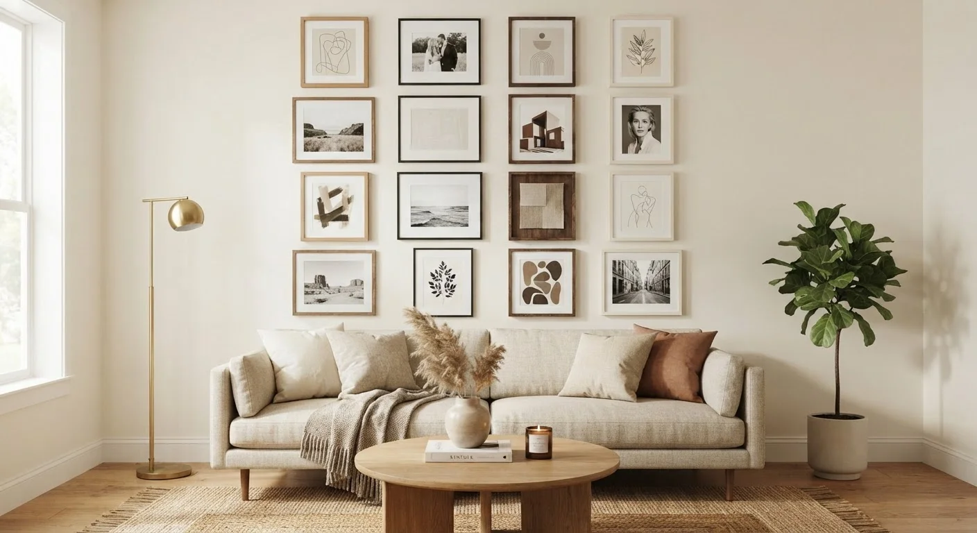
A gallery wall should feel like a deliberate design choice - a collected, personal statement that adds warmth and character to a room. When it misses, the result is a wall that looks cluttered, lopsided, or just unconvincing. The good news: most problems stem from a small set of predictable mistakes, not a lack of taste. Identifying and correcting them turns a frustrating arrangement into one of the most satisfying features in a home.
If your gallery wall has always felt slightly off but you couldn't pinpoint why, the mistakes below are likely the culprits. Addressing even one or two of them can make a substantial difference. For anyone starting from scratch, our guide to decorating from a blank slate is a helpful starting point for the broader room context before zooming in on a single wall.
Hanging frames too high on the wall, disconnected from furniture and the room's visual center.
Why it happens: Many people default to eye level while standing, which places artwork higher than it reads from a seated position - where most people spend time in living spaces.
Ignoring the size relationship between the wall and the arrangement, resulting in a cluster that looks lost or overwhelmed.
Why it happens: Shoppers often choose art they love individually without considering how it will read collectively against their specific wall dimensions and furniture scale.
Using inconsistent spacing between frames, so the arrangement looks scattered rather than curated.
Why it happens: People often eyeball spacing and make small adjustments on the fly, which compounds unevenness across a larger grid.
Mixing too many frame colors, finishes, and styles without a unifying thread, creating visual noise instead of character.
Why it happens: Eclectic galleries are popular and the goal of mixing pieces is appealing, but without a unifying element the result can feel chaotic.
Skipping a floor-plan layout and hanging directly on the wall, leading to extra holes and misaligned groupings.
Why it happens: Enthusiasm drives people to start hammering before planning, and visualizing a finished arrangement in the abstract is genuinely difficult.
Treating every piece in the gallery as equally important, resulting in a flat arrangement with no focal point.
Why it happens: When all pieces are the same size or visual weight, the eye has nowhere to land, and the wall feels like wallpaper rather than art.
Pulling the Whole Wall Together
Once the individual mistakes are corrected, step back and evaluate the arrangement as a whole. A well-executed gallery wall has three qualities: it feels anchored to the space around it, the pieces relate to each other in some meaningful way, and the spacing is deliberate enough to read as intentional rather than accidental.
Mark Walls Thoughtfully to Protect Surfaces
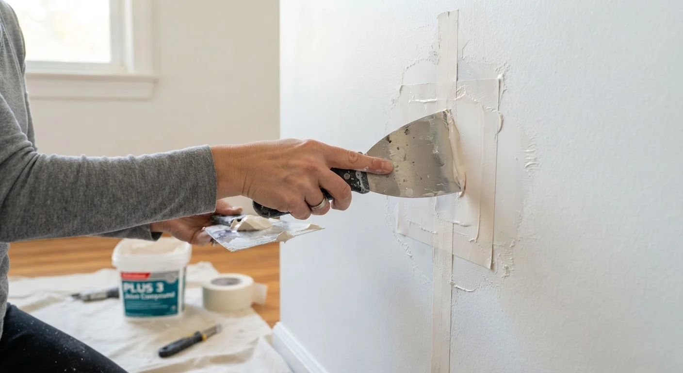
Before hanging anything, use painter's tape and paper templates to map your layout directly on the wall. Avoid pressing hard pencil marks or adhesive products that could damage paint or drywall. If you're planning work on freshly painted surfaces, consult our wall prep guide to understand curing times before mounting anything.
Scale matters beyond the wall itself. A gallery that works beautifully on a large dining room wall can overwhelm a narrow hallway. If you're decorating a smaller space, strategic visual choices - including how and where you hang art - can actually make the room feel more open rather than compressed. Keep frame depth and visual weight light in tight spaces.
Before buying anything new to supplement an existing arrangement, it's worth doing a quick audit of what's already on the wall. Our room refresh checklist walks through how to assess what's working and what isn't before spending more. Often, rearranging what you already own - removing one piece, shifting the anchor, or evening out the spacing - is enough to transform the result entirely.